How to Organize Your Phone Home Screen So You Actually Find Apps
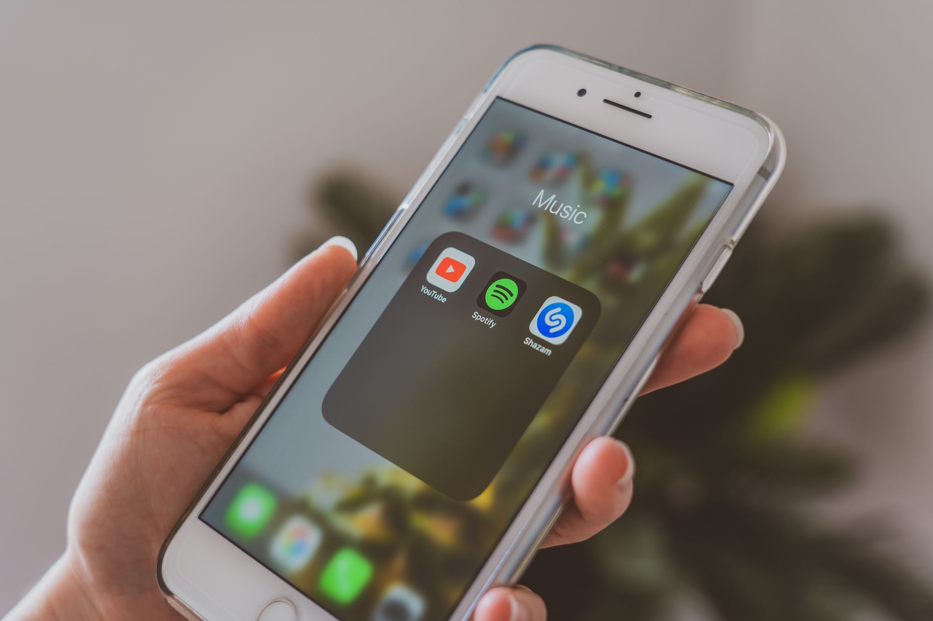
Last month I spent about thirty seconds scrolling through my phone looking for the calculator app. Swipe left. Swipe right. Swipe into a folder called “Utilities” that I made three years ago and never updated. The calculator was on the third home screen for reasons I cannot explain. I had downloaded the app, used it, and my phone apparently placed it wherever it felt like.
That was the moment I decided to actually organize my home screen instead of just living with the chaos. It took twenty minutes and I have not lost an app since.
One Screen Rule
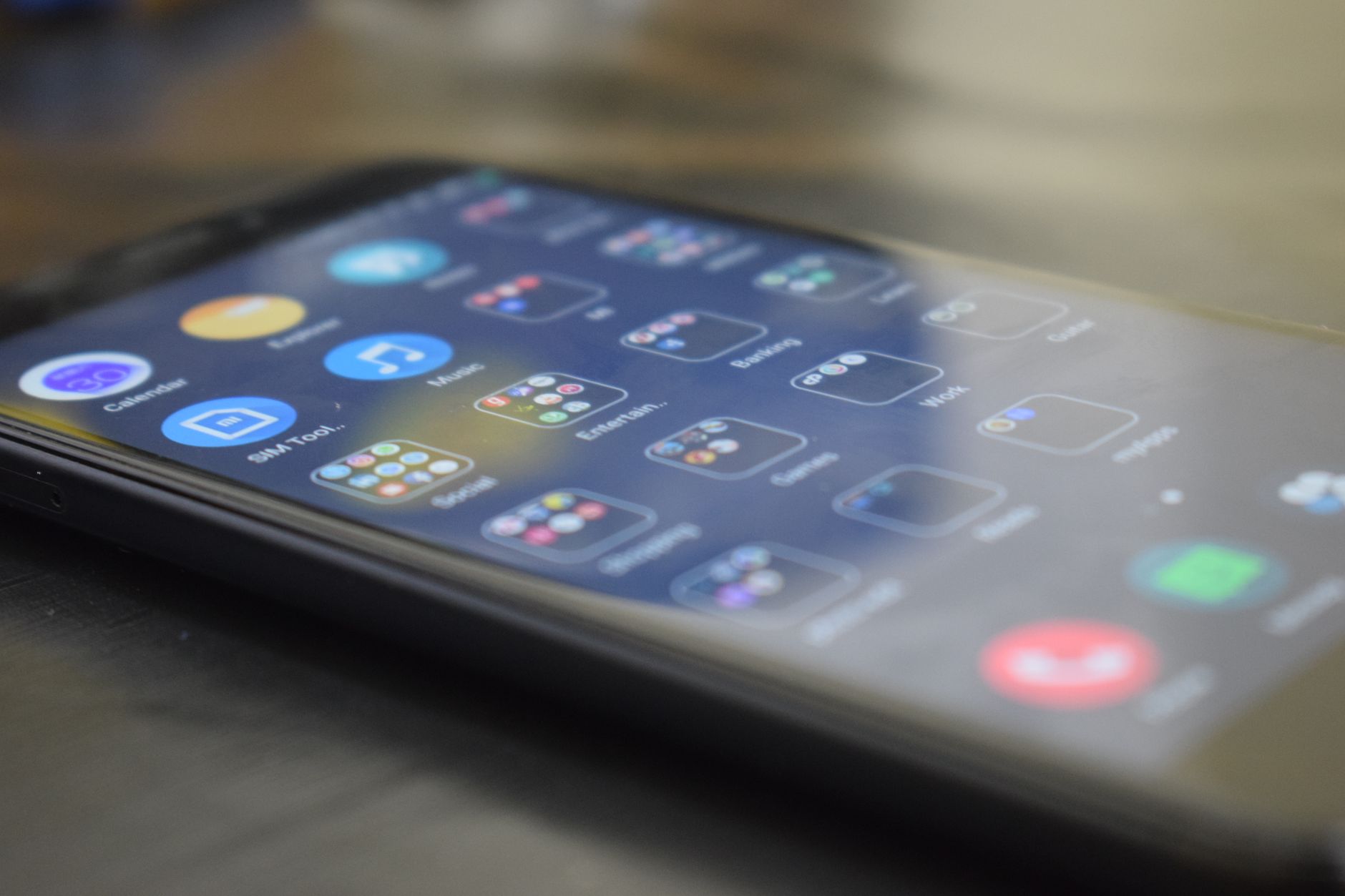
Everything you use daily should fit on one screen. No swiping. If you have to swipe to find an app more than once a day, that app belongs on the home screen. For me, that is messages, email, calendar, camera, browser, maps, music, and notes. Seven apps. That is it.
Everything else goes on the second screen or into folders. Your phone’s search function — swipe down on iPhone, the search bar on Android — finds any app in under a second. You do not need to see the app icon to open it.
Folders by Action, Not Category
Do not make a “Productivity” folder. You will never open it. Instead, group apps by what you are doing: “Morning” for news, weather, and calendar. “Travel” for maps, rideshare, and airline apps. “Pay” for banking, Venmo, and budgeting apps. When you open the folder, everything you need for that activity is right there.
Dock for the Four Essentials
Put the four apps you open most often in the dock at the bottom. These should be the apps you reach for without thinking — messages, browser, email, camera. The dock is accessible from every home screen, so these are always one tap away no matter where you are.
Widgets — Only If They Save a Tap
A weather widget is useful — you get the forecast without opening the app. A calendar widget that shows your next three events saves you opening the calendar fifteen times a day. But widgets that just show a clock or a photo? They waste space. A widget should earn its spot by showing you actionable information at a glance.
Quick Summary: One screen for daily apps. Folders named by activity, not category. Dock holds the four most-used apps. Widgets only if they save you a tap. Everything else, just search for it.